Improved mobile navigation in photographer app
Only a small percentage of users are logging onto the photographer's dashboard per week to manage their client galleries, but when they do it's because something has to get done "right now". Today we launched a site-wide overhaul to mobile navigation. While we had good coverage for the core gallery tasks, there were some parts of the app that were a little hard to get to. Every page you visit will now have a mobile menu that is 1:1 with the desktop version of the application.
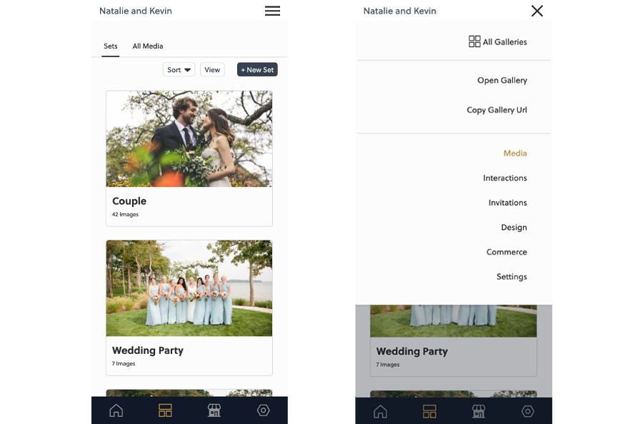
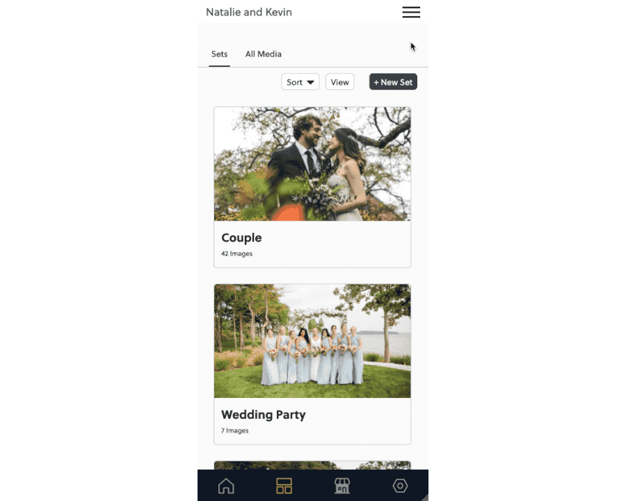
The layout of the items has been adjusted to the right to make for easier finding when using your phone one-handed as well as general appearance and behavior adjustments. Some menus even have had some enhancements to specifically help mobile workflows such as adding "copy-URL" for client galleries.
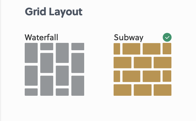
While testing mobile navigation I found that the gallery design page was not laying out properly for mobile at all. That page will now correctly display for smaller screens. I've also received a small amount of feedback in the past that it was not immediately obvious what the current selection was. To help improve this each selection will be continued to be highlighted in gold, but I've also added a small green checkmark to better communicate the design selection for your client galleries.
cover photo by mehdi lamaaffar