In striving to make the tools you use on a daily basis beautiful and easy to use, we've launched a large overhaul to how galleries look to you inside your tool.
When we first launched, we had a more utilitarian approach to displaying galleries to you, the photographer. Through interviews and conversations, we realized how much of an impact these screens have on your perception of not only the tools you are using but your own work.
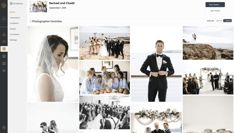
So instead of seeing a 1x1 square grid that represents your photos, you will now see a layout that will mimic that of the one your customers will see. This gives you a much better idea about how your gallery feels and flows without having to lunch the gallery to inspect the results of ordering and design changes. You will also still have access to the same power drag-and-drop re-ordering tools, which will now provide an even more satisfying and instant visual confirmation.
We've also made improvements to the performance of the display grids for galleries and sets. Those pages will now be more performant, load higher quality images faster, and have a more cohesive feeling.